Swedish Exhibition Agency
Brand identity
Art direction
Graphic manual
Exhibition design
Poster series
Annual reports
Print
Red Dot Design Award 2018
German Design Award, Special Mention 2018 Red Dot Design Award, Best of the Best 2017 Red Dot Design Award 2016
Red Dot Design Award 2013
German Design Award, Nominee 2012
Red Dot Design Award 2010
Art direction
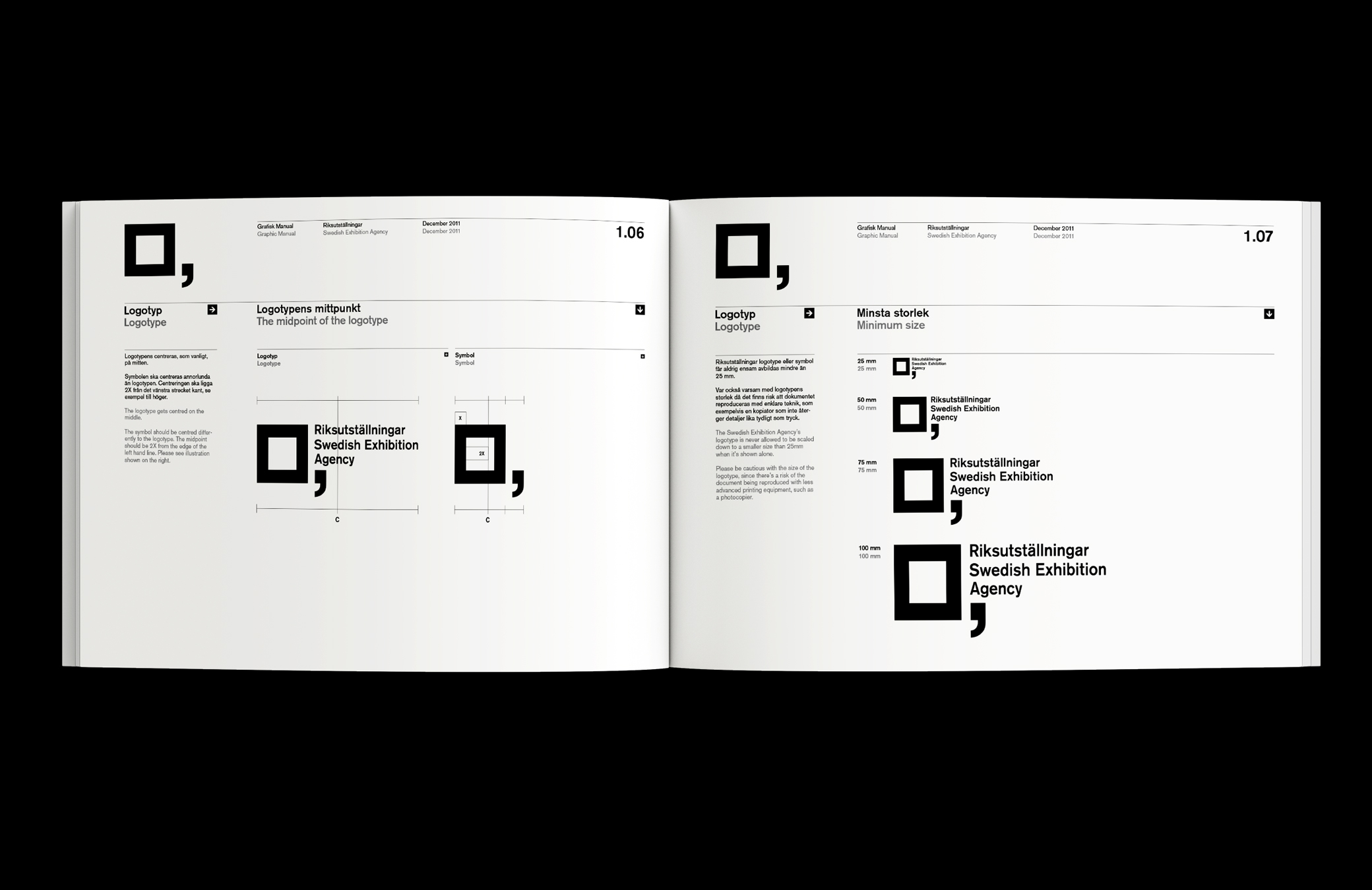
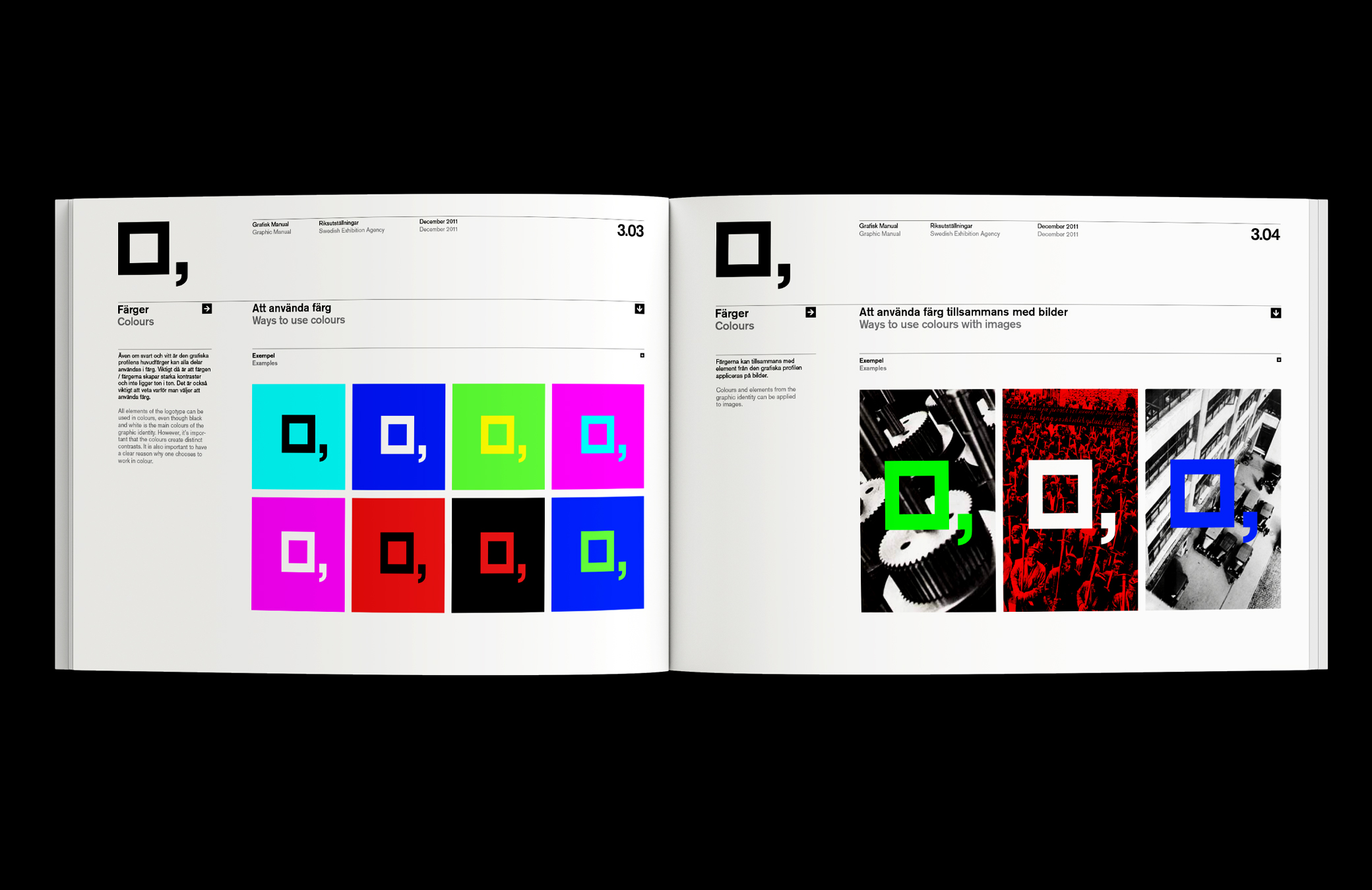
Graphic manual
Exhibition design
Poster series
Annual reports
Red Dot Design Award 2018
German Design Award, Special Mention 2018 Red Dot Design Award, Best of the Best 2017 Red Dot Design Award 2016
Red Dot Design Award 2013
German Design Award, Nominee 2012
Red Dot Design Award 2010
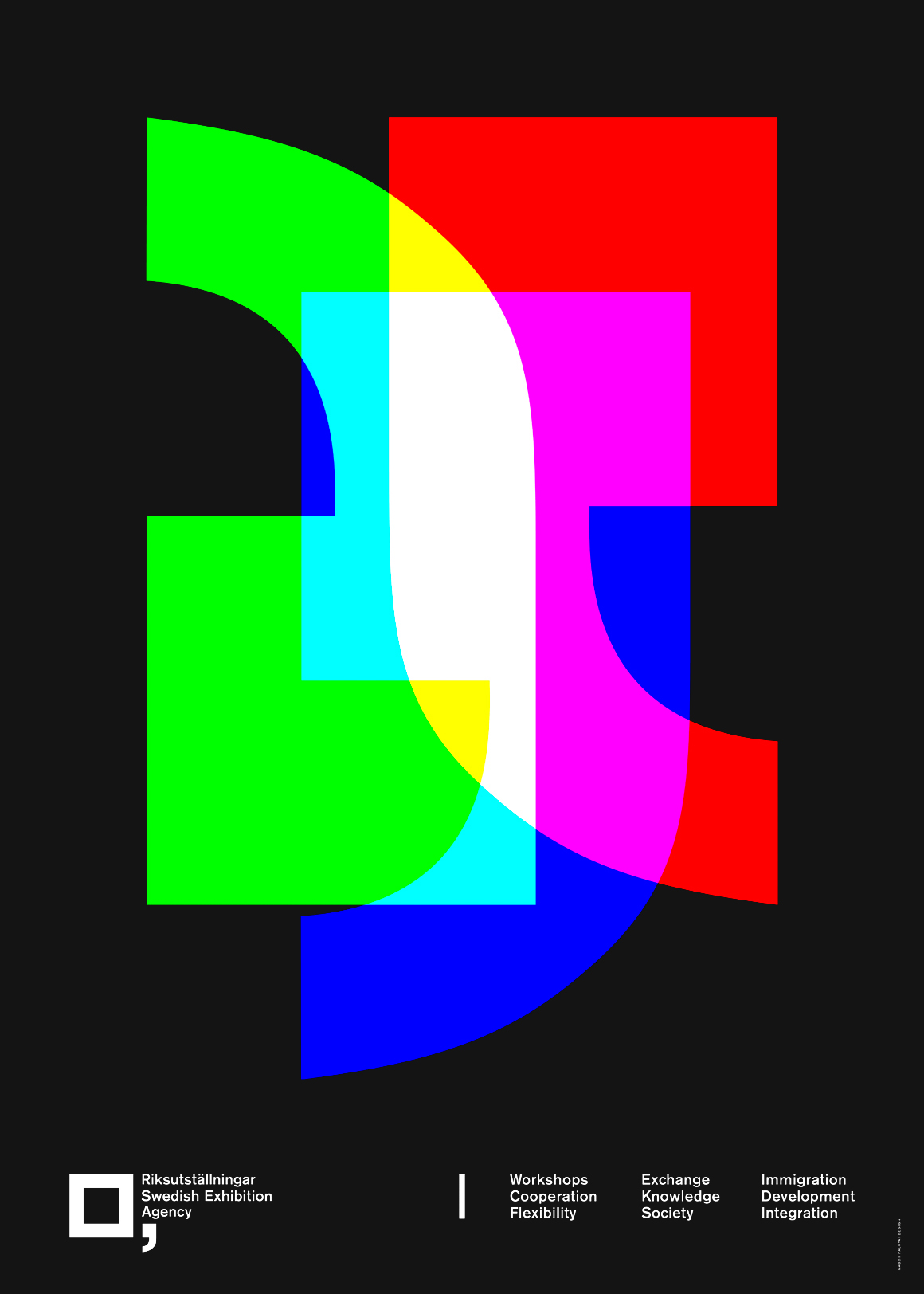
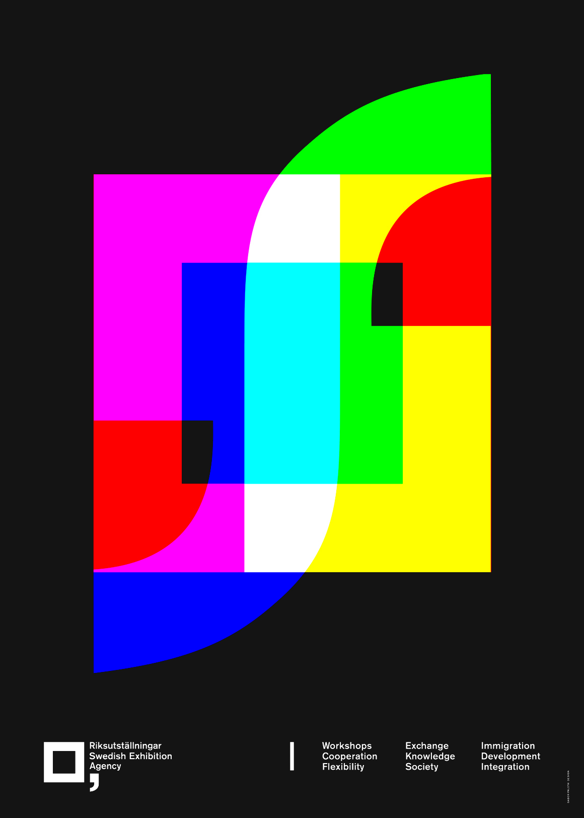
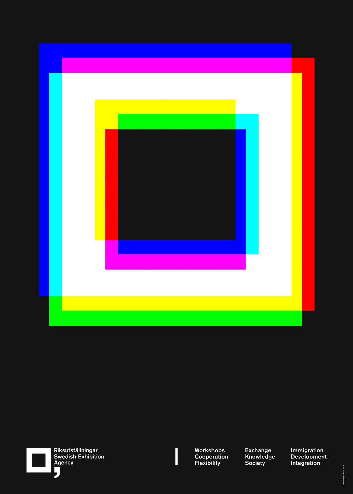
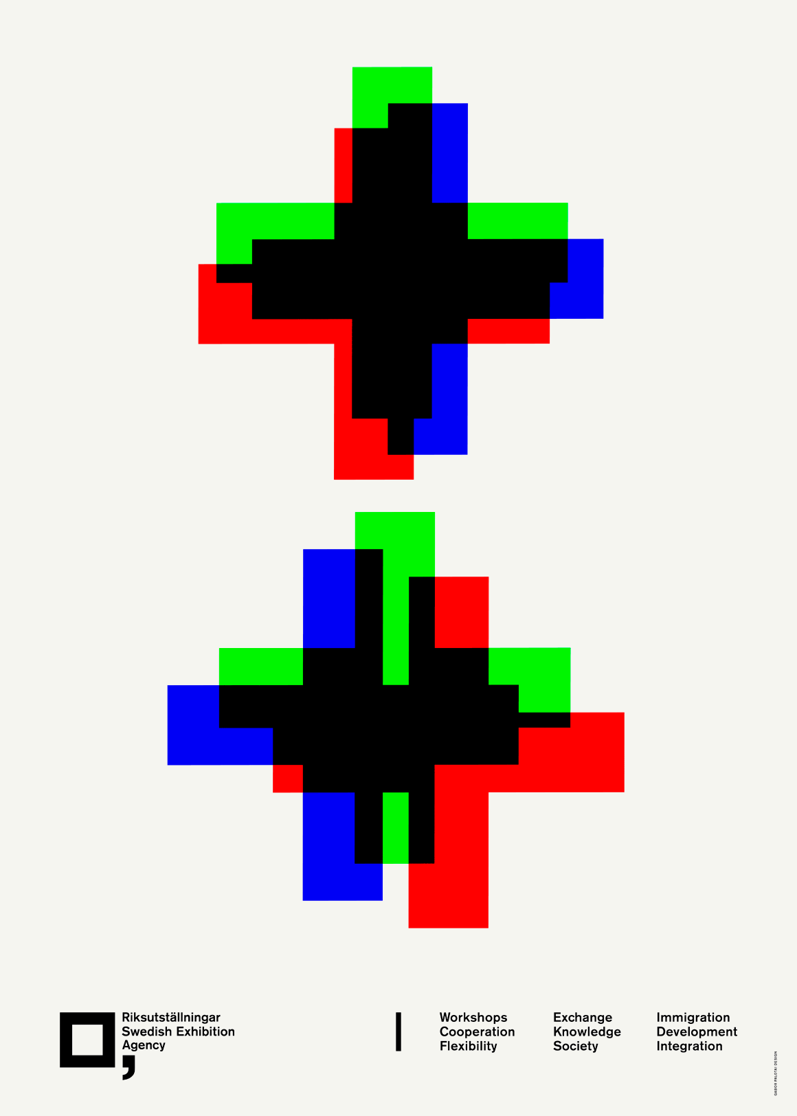
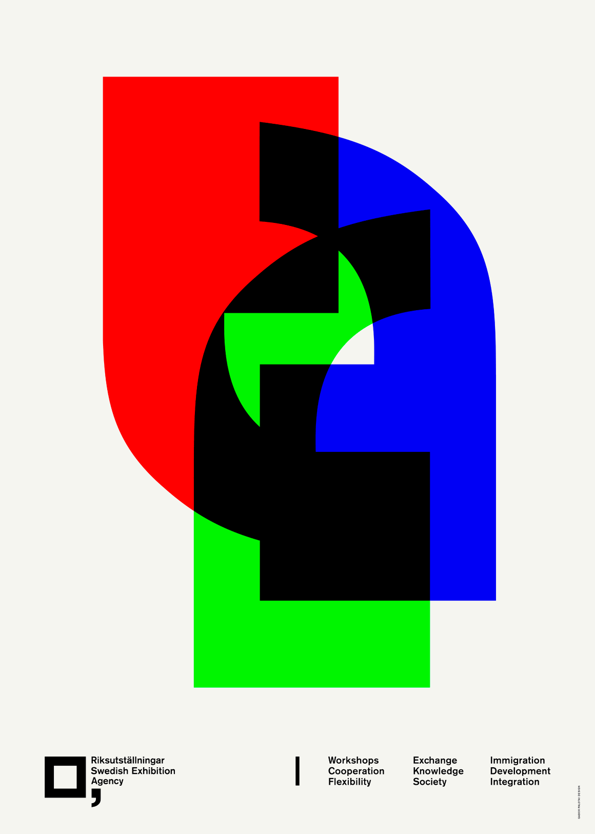
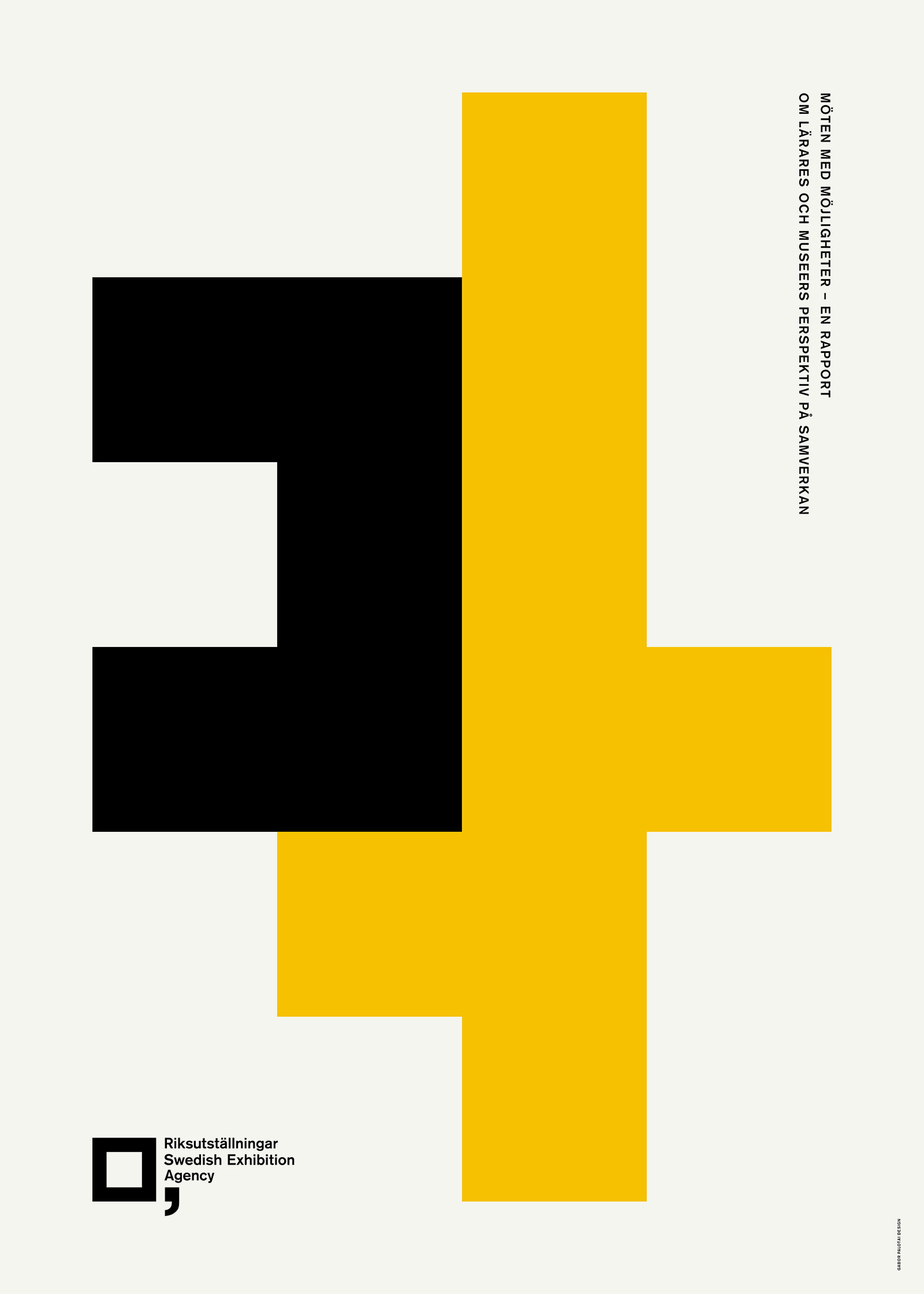
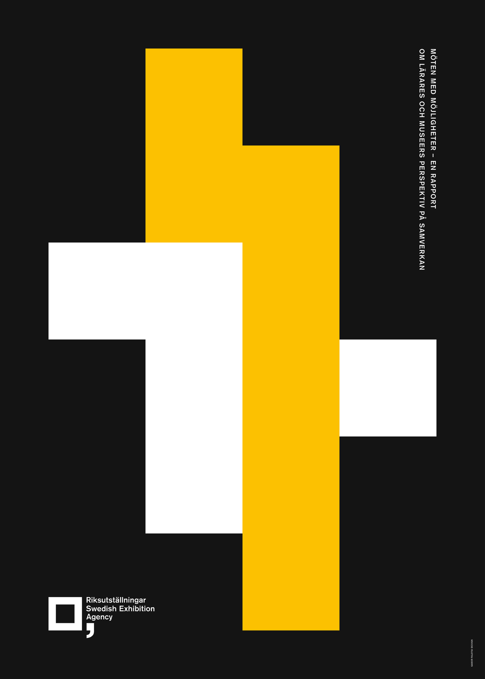
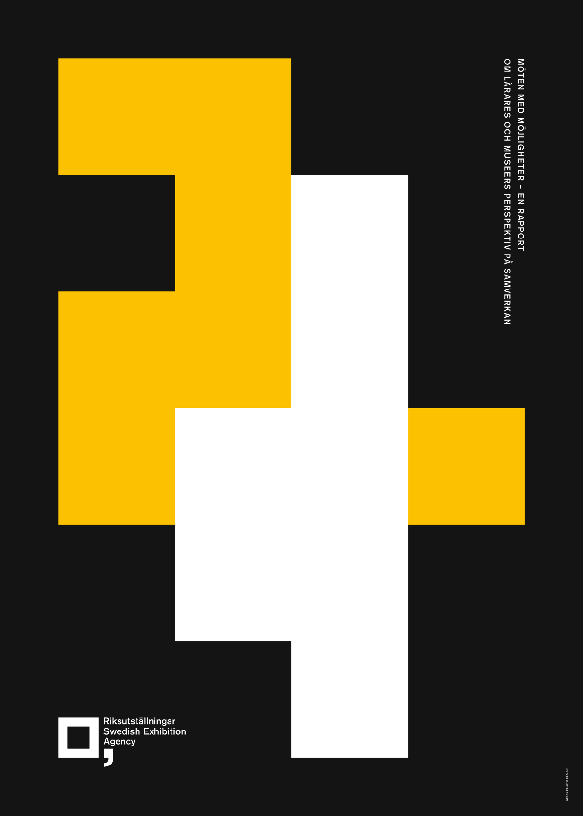
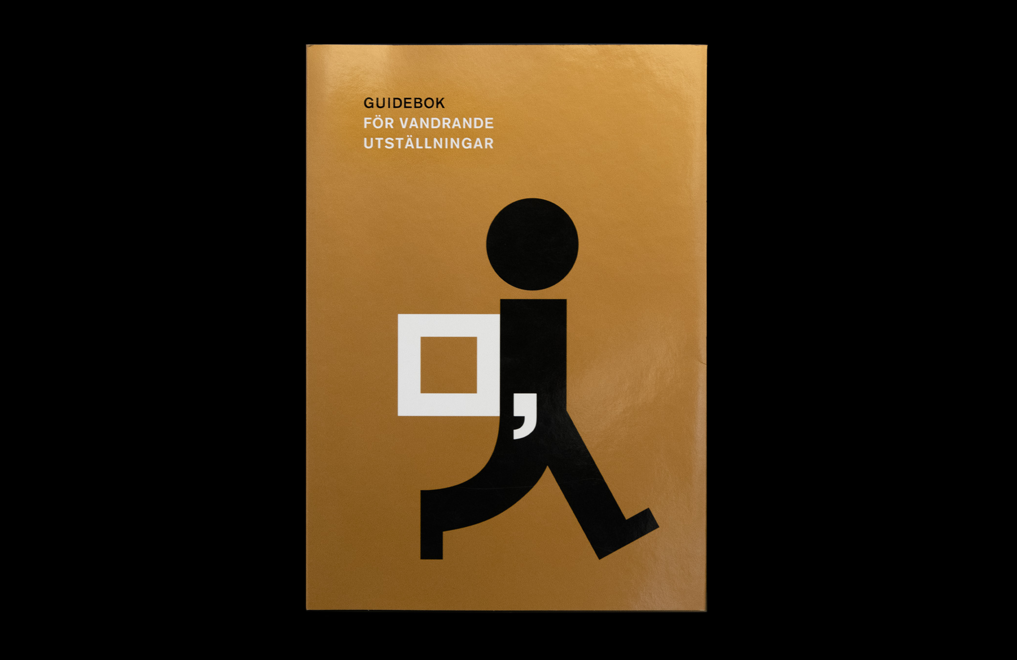
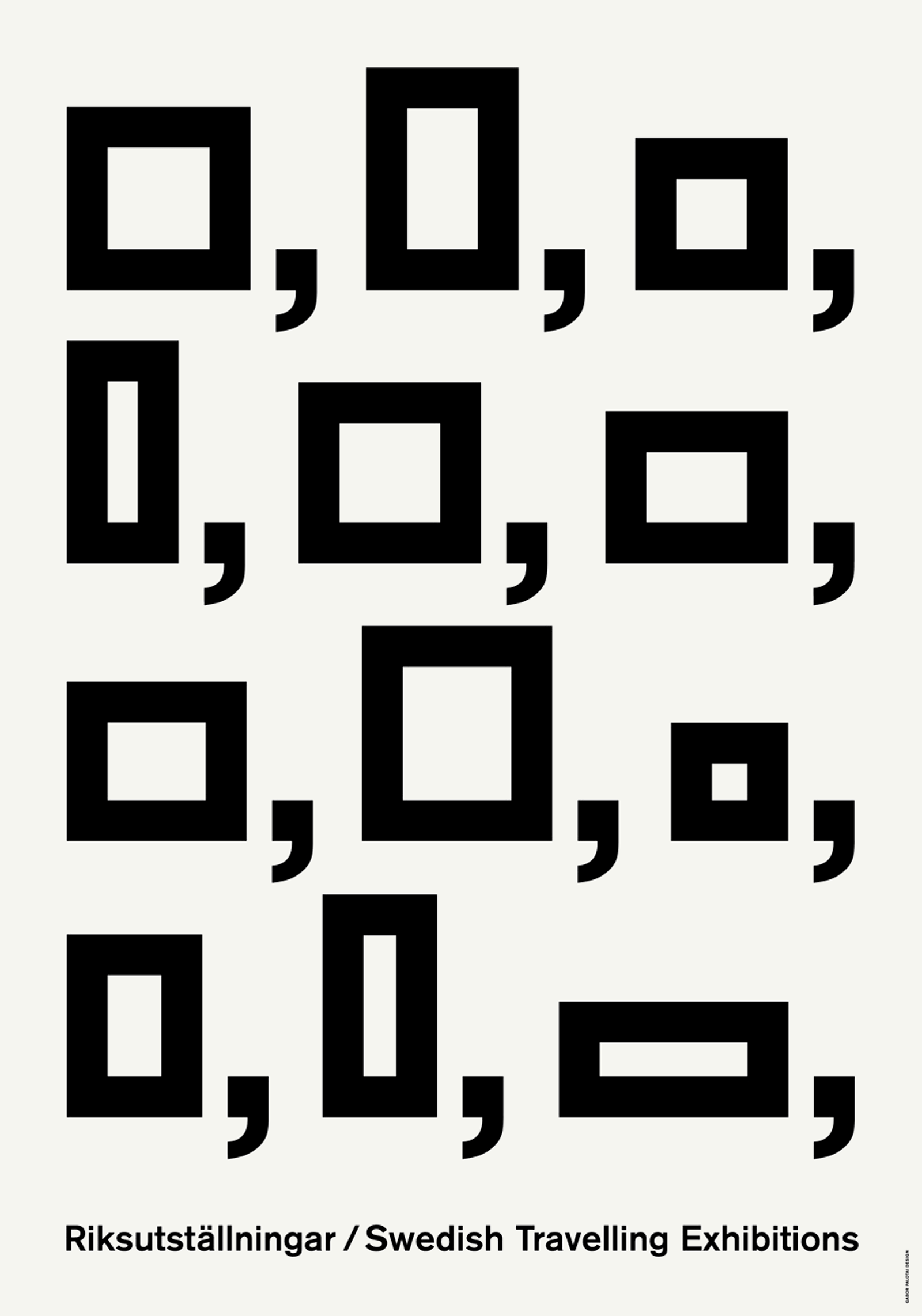
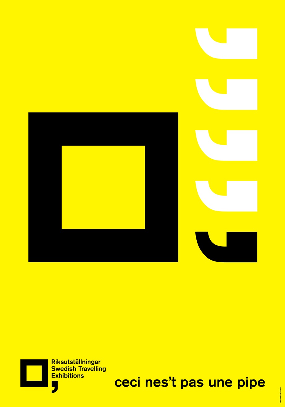
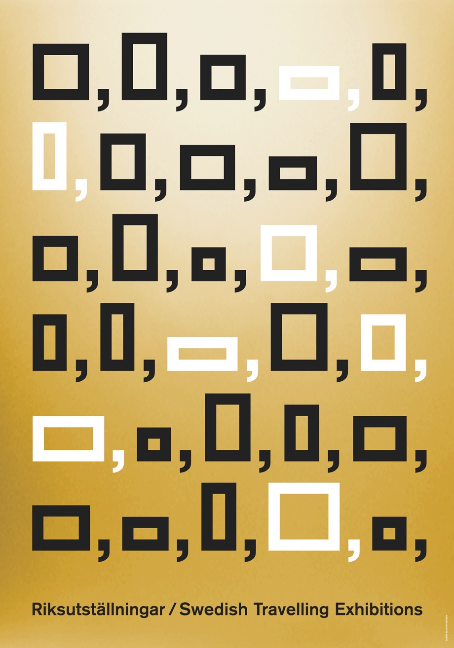
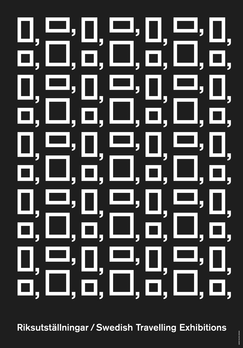
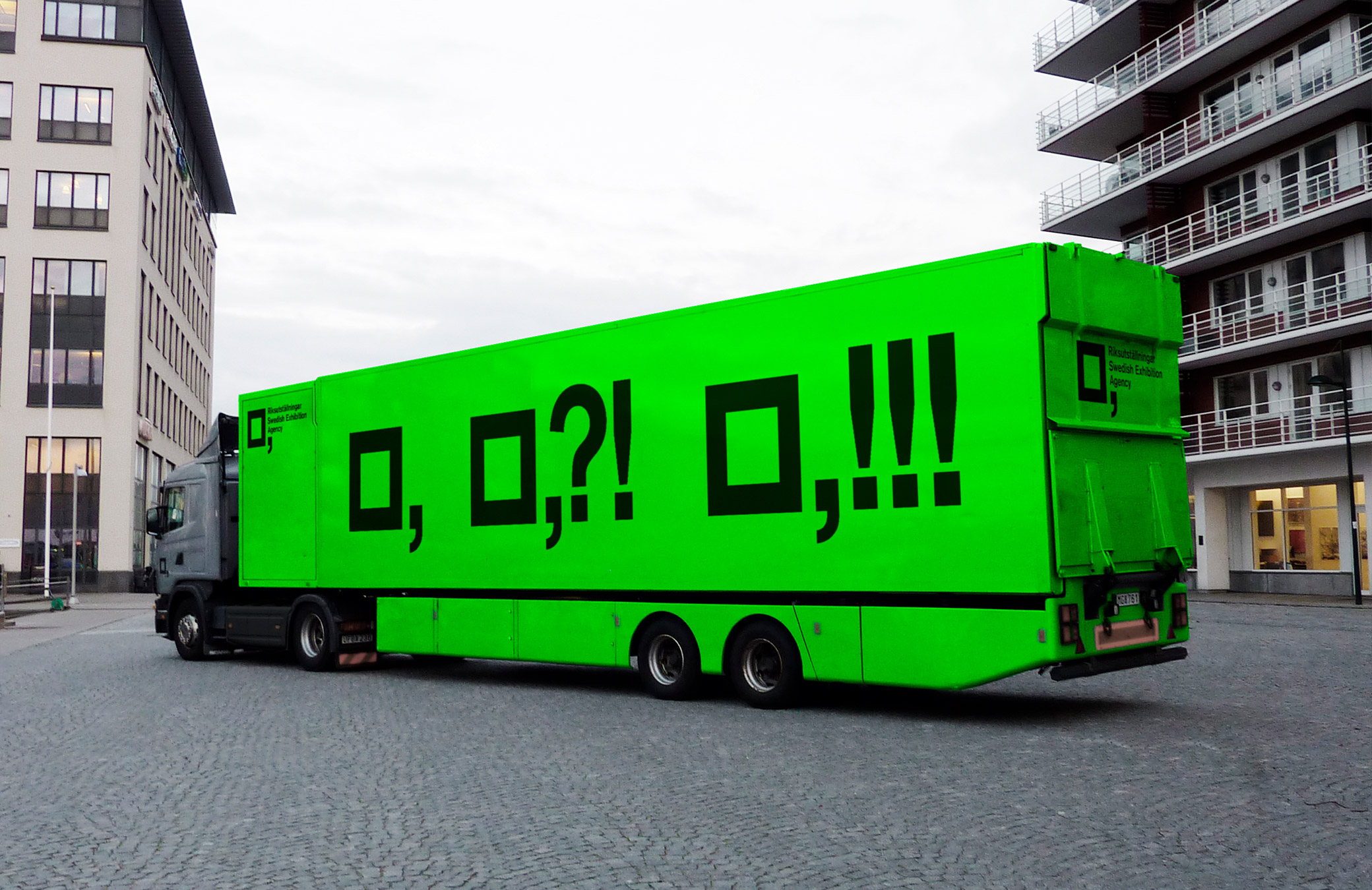
The Swedish Exhibition Agency, also Swedish Travelling Exhibitions, was a government agency whose task was to promote development and cooperation within the fields of exhibitions. Gabor Palotai Design’s visual identity is founded on two basic shapes: the square, as a picture frame, and the comma, for to be continued, developed, and involving. Together, these archetypical shapes form the intense expressions of this vivid visual identity in constant dialogue with the surrounding world.















Swedish Exhibition Agency
The Swedish Exhibition Agency, also Swedish Travelling Exhibition, was a government agency whose task was to promote development and cooperation within the field of exhibitions. This graphic identity is founded on two basic shapes – the square, as a picture frame, and the comma, for to be continued, development, involvement. These archetypical shapes are democratically availible to anyone. Together they form flexible expressions to create a strong brand in constant dialog with the surrounding world.
Brand Identity
Art Direction
Exhibition Design
Red Dot Design Award 2018
German Design Award,
Special Mention 2018
Red Dot Design Award,
Best of the Best 2017Red Dot Design Award 2016
Red Dot Design Award 2013
German Design Award,
Nominee 2012
Red Dot Design Award 2010




View more Work
View more Work
