Riksutställningar Årsredovisning Poster Series
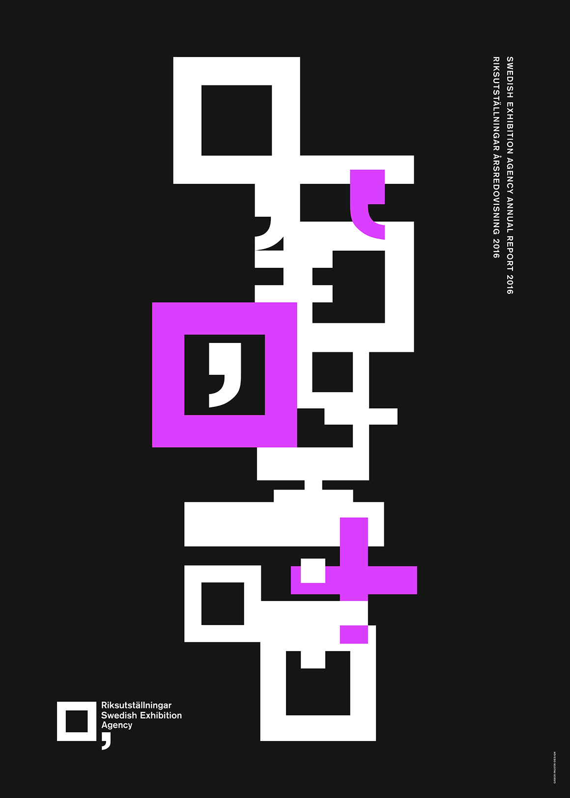
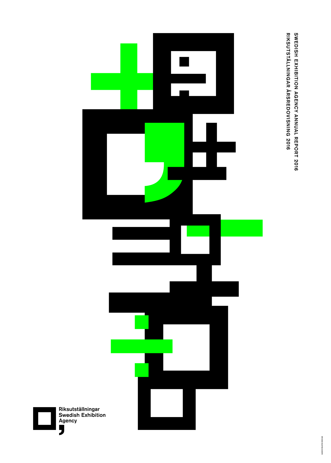
Swedish Exhibition Agency’s recent annual report showcases vivid graphic collages consisting of new and vibrant variations of Gabor Palotai Design’s graphic identity for The Swedish Exhibition Agency – the square (as a picture frame) and the comma (for to be continued, development and involvement). The animation of the logotype in multicolor stands for multiculture, which is futher enhanced by the equal sign that also alludes to the world of accounting.
Awards
Red Dot Design Award, Best of the Best 2017
Statement by the jury
The aesthetic compositions in this poster series are based on the Swedish Exhibition Agency’s logo, comprised of a simple square and a comma. Stacked up in different formations, the symbols are arranged to form self-contained and visually fascinating sculptures. Featuring an appearance that is also mathematical in appearance, they correspond to the identity originally designed for the agency’s annual report


