Contempo
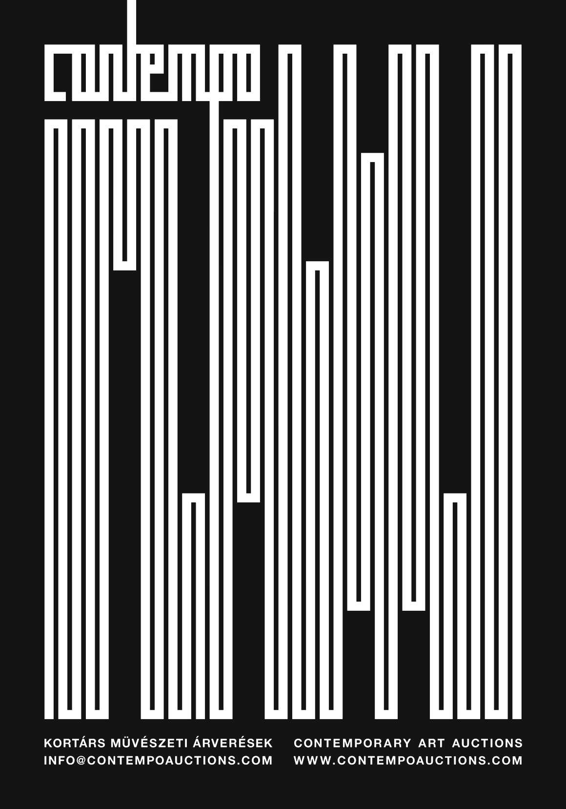
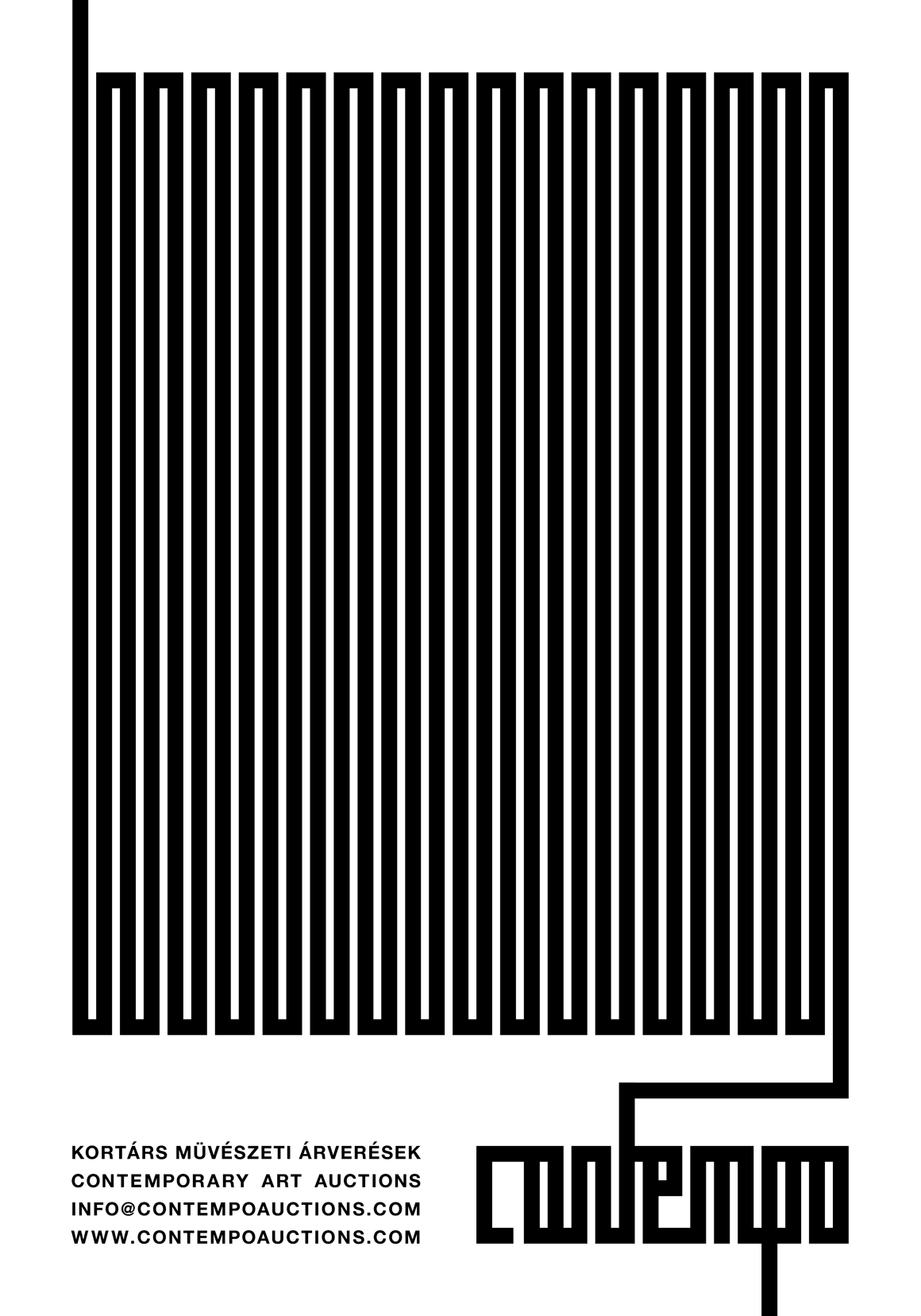
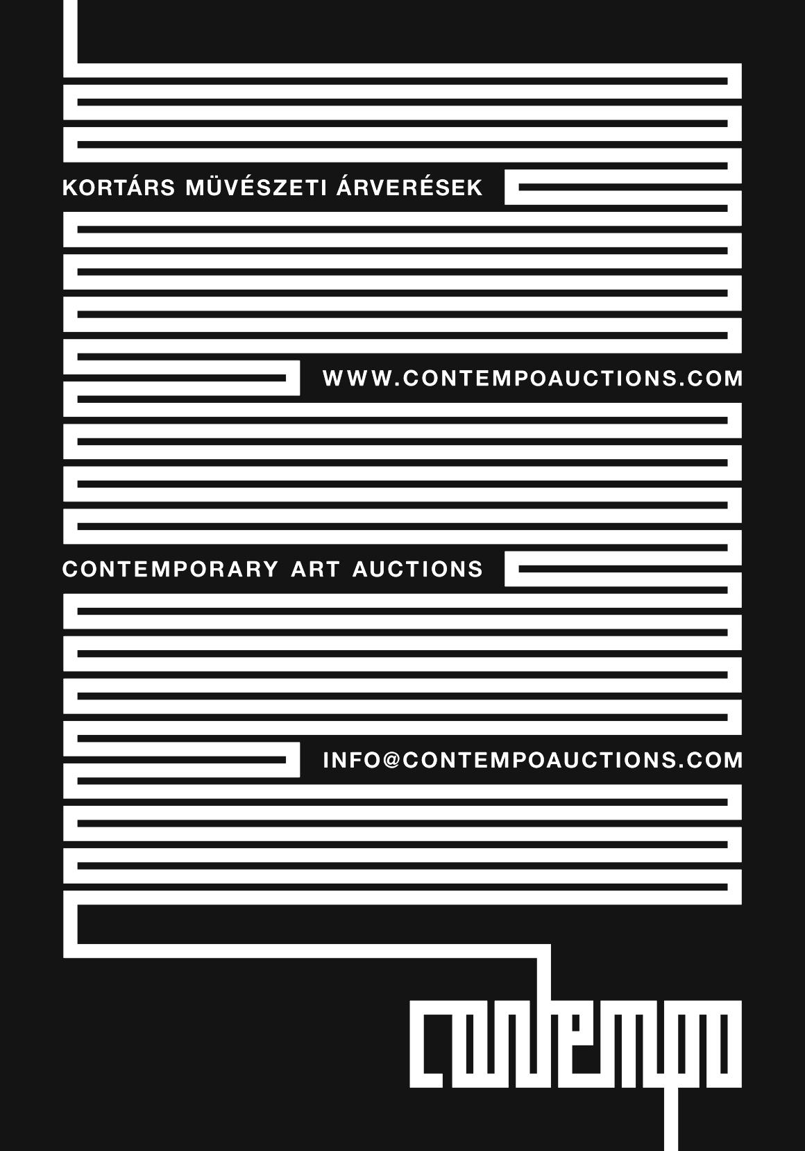
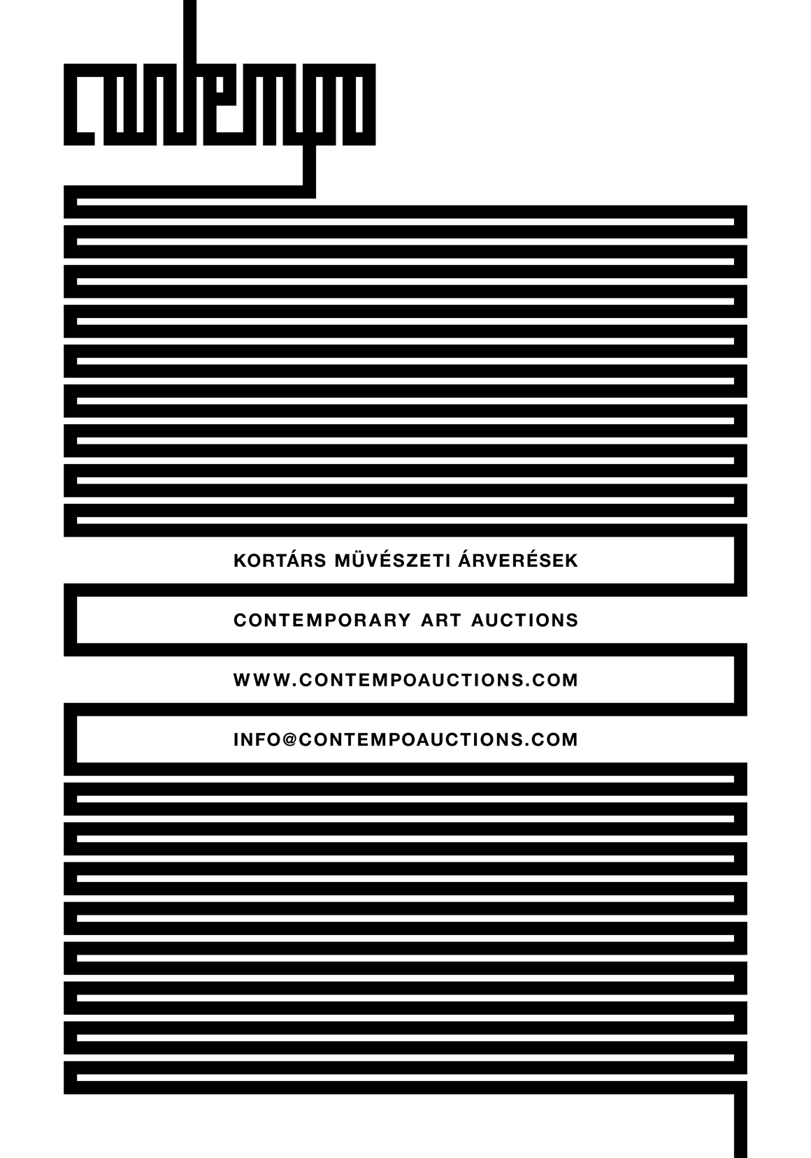
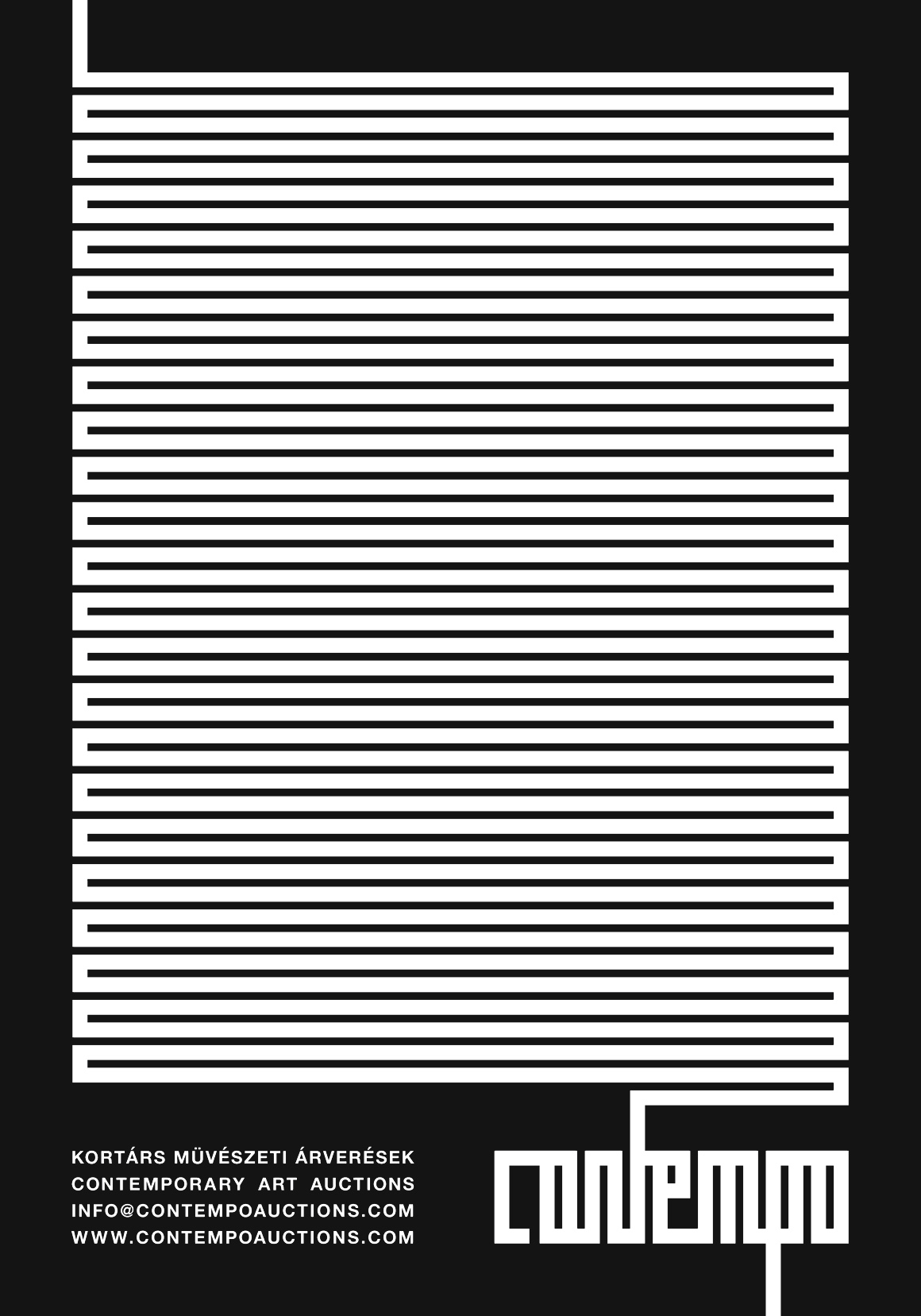
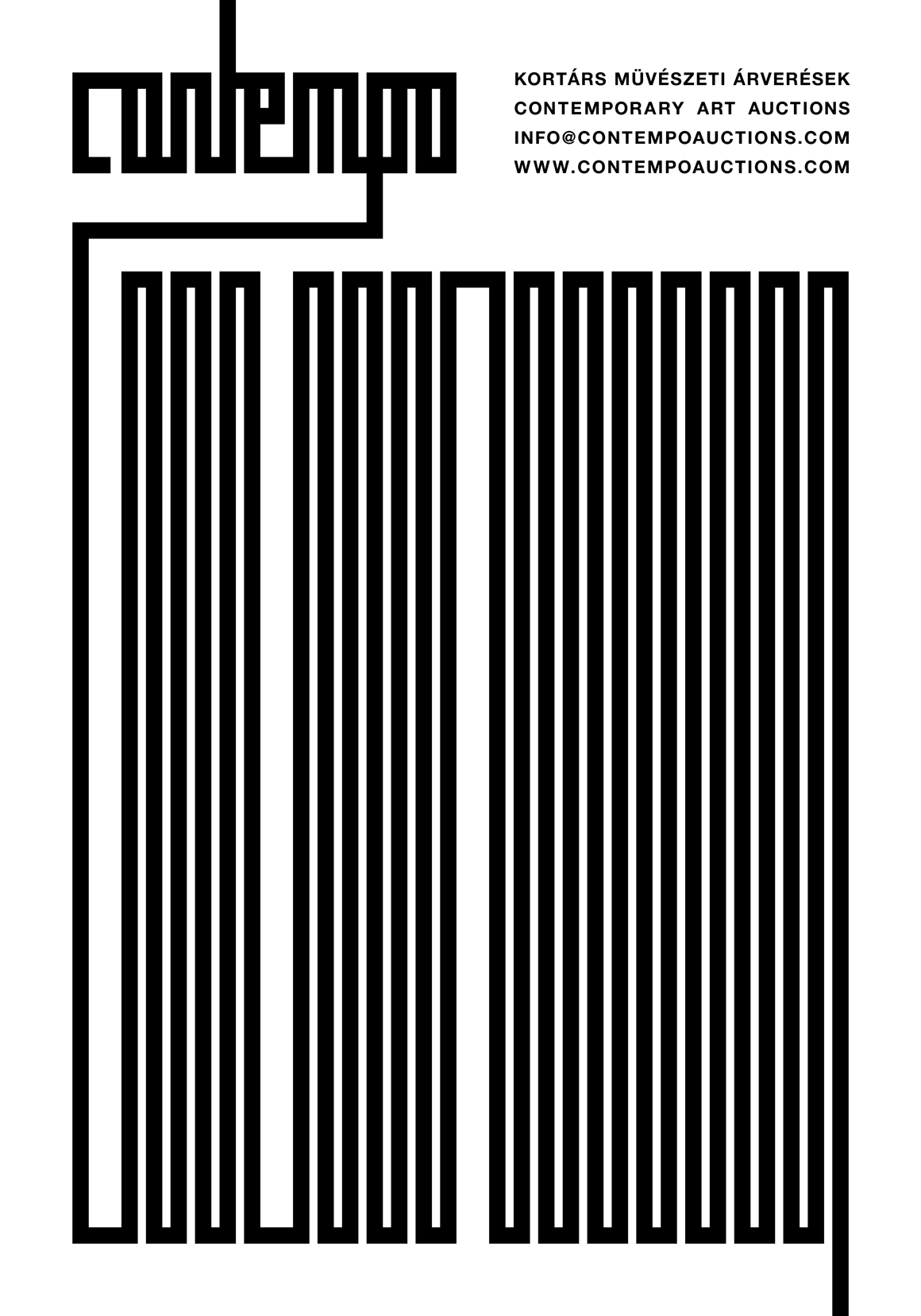
The posters for the contemporary art auction house Contempo display a sharp but curious play with the logotype that Gabor Palotai Design recently made for them. The letters in the name build up a graphic image, and urges to be read not only from left to right, but right to left, in the middle, and upside down.
At these posters the letters t and p are elongated to the extreme, to suggest continuation, and constructs different patterns that become a graphic artworks by themselves.
︎︎︎ contempoauctions.com
Awards
Red Dot Design Award 2017
German Design Award 2019
