︎
Work
Awards
Archive
Studio
Colab
Poster Design
Book Design
Artworks
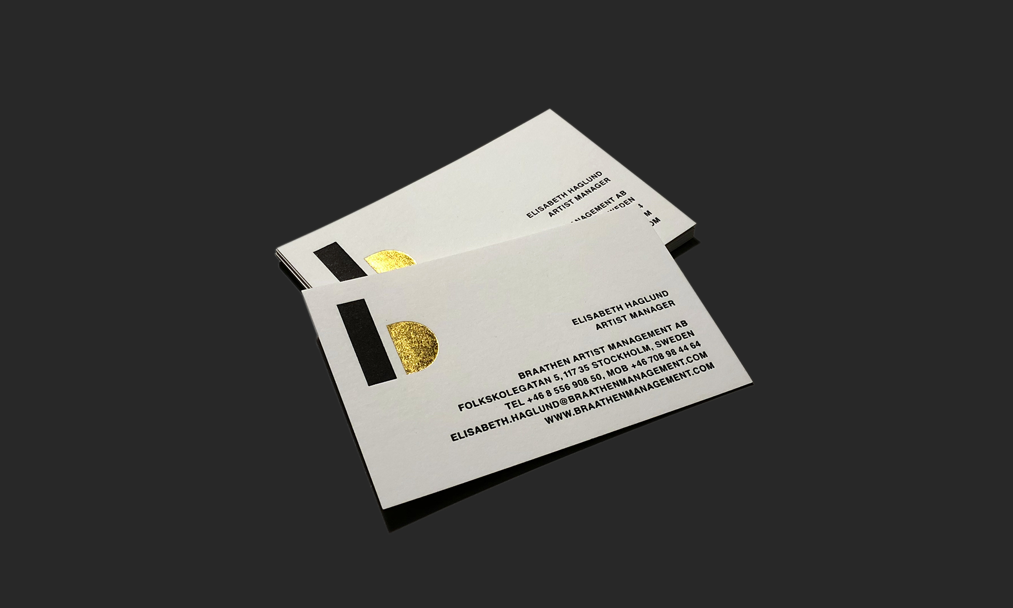
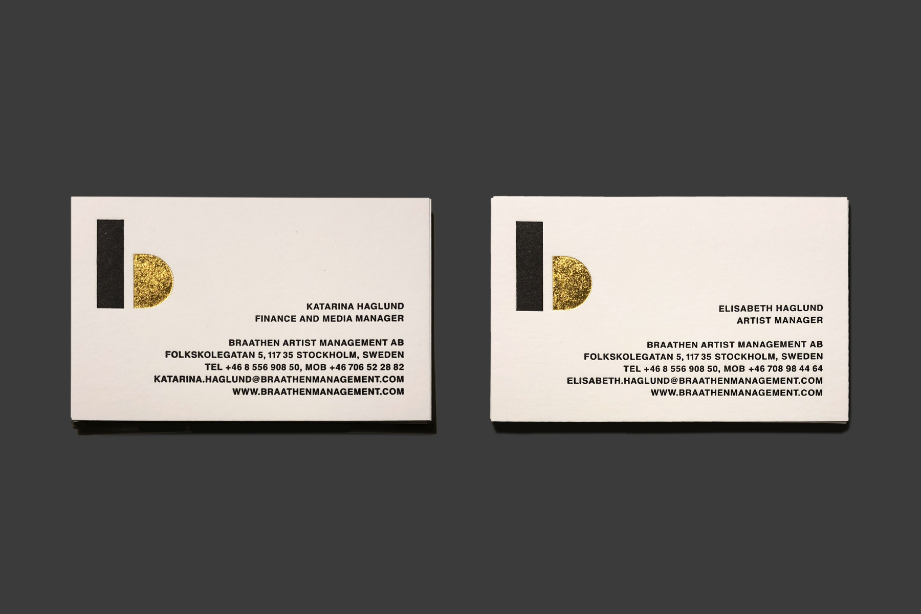
Braathen Artist Management
The visual identity for Braathen Artists Management.
braathenmanagement.com
Gabor Palotai Design
Office
Västerlånggatan 76
111 29 Stockholm, Sweden
Membership
Gábor Palotai is a member of
AGI / Alliance Graphique Internationale
Reach out
For business inquiries
design@gaborpalotai.com
Phone +46 707 52 66 01
For internship
Send your internship application and portfolio to:
design@gaborpalotai.com
Connect with us
Instagram
Facebook
Wikipedia
AGI
Linkedin
Behance
︎︎︎︎︎︎︎︎︎︎︎︎︎︎︎︎︎︎
Work
Awards
Book Design
Artworks
Archive
Studio
© 2021 Gabor Palotai. All Rights Reserved.